

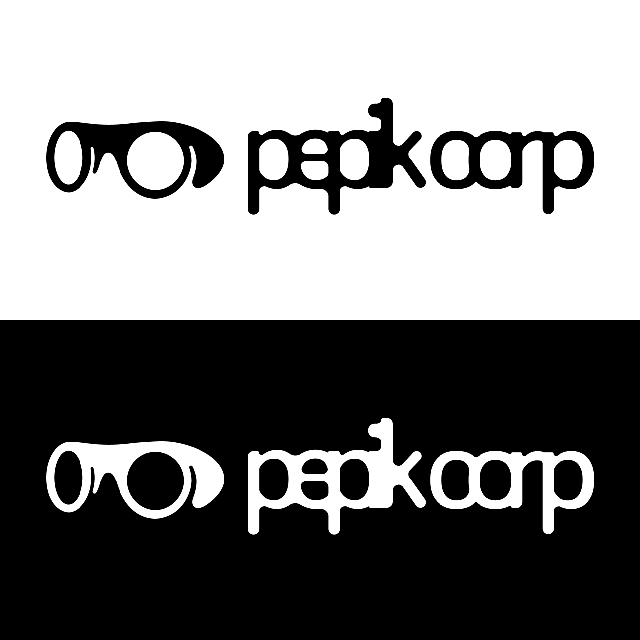
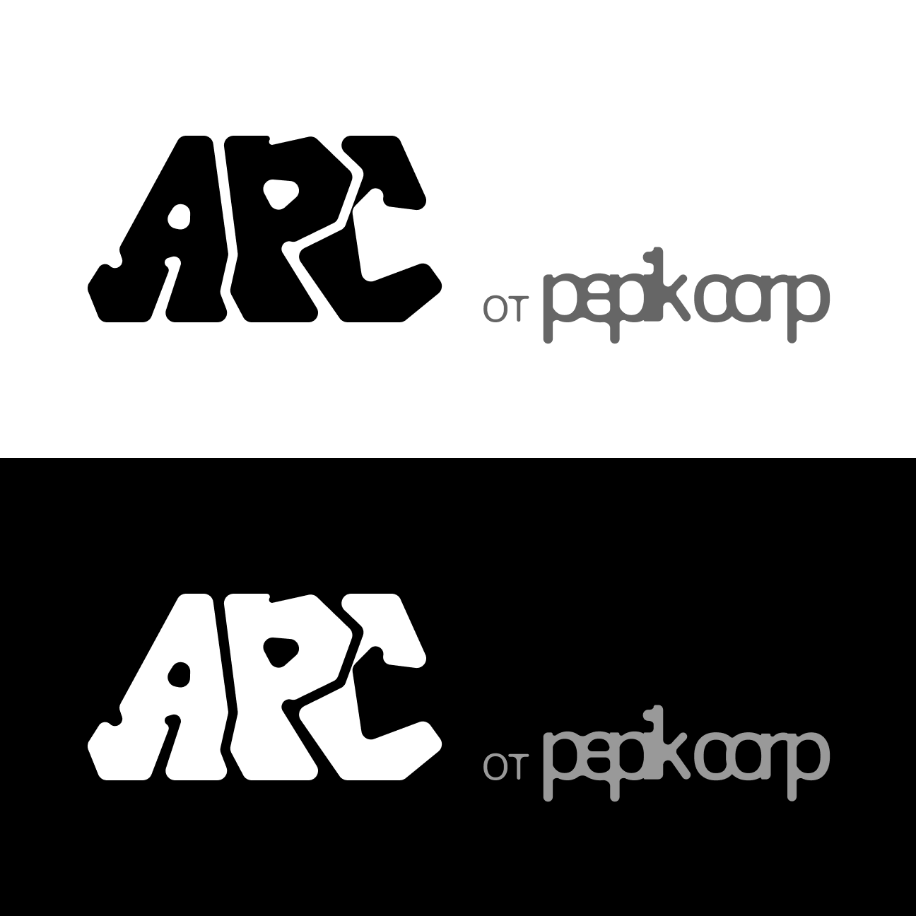
This project is built around an iterative search for form. I designed two logos — one for Pepik corp. and one for the Ars sub-brand — testing each version for readability, scalability, and performance across different contexts. The final solutions are resilient, context-aware, and work both together and independently.
Takeaways
This project is an exploration of how a character’s personality can shape an entire brand identity. My goal was to create not just a logo, but a lively, memorable image that sets the tone for all communications.
In the process, I focused on finding a unique form and plasticity that would distinguish Pepik from competitors. Working on this case taught me how to build a consistent visual environment around a single central element and maintain brand recognition even when the context changes. The result is a flexible identity that easily scales from icons to merchandise.
Did you think there’d be something here?
